Meijer Mobile App
UI/UX Design and Research on iOS and Android, from Concept to Launch
Meijer is a Midwestern grocery supercenter chain, like HEB in Texas, Kroger in California, Publix in Florida, and Safeway in the State of Washington.
The Meijer Mobile app is built to offer pickup and delivery of over 70,000 items found in your local Meijer location.
⭐ 4.7 out of 5 stars on 🔗 Apple, of 138.6k reviews
⭐ 4.6 out of 5 stars on 🔗 Android, of 58.1k reviews
Overview
Grocery Delivery App for iOS and Android
Meijer is a Midwestern grocery supercenter chain, like HEB in Texas, Kroger in California, Publix in Florida, and Safeway in the State of Washington.
Growing and scaling for the digital grocery sector and Meijer’s presence over long periods of time meant new ways of thinking and careful critique. We wanted to introduce a mindset for a natural lifestyle of digital grocery for Meijer that feels relevant, cohesive, trusted, and food freshness—not a drop-in of new features. It’s important to understand the context in which users will be purchasing items through the Meijer Mobile app, and tailor that experience to cater to those various situations: for instance, buying an essential item during an Uber ride or a quick lunch break requires a different user experience than browsing and “window” shopping on evenings and weekends.
We studied our consumers to discover new needs and insights, and then craft every interaction to build brand love. My team of digital user experience and interface designers set out to ensure a clear and cohesive understanding of our business objectives, guest segments and behaviors, strategies and tactics, overcoming technical obstacles, and measuring success.
Press
WOOD TV | “‘Game changer’: Mobile app helps visually impaired shop at Meijer”
FOX | "Meijer Home Delivery Provides Convenient Shopping for Anyone, Anytime, Anywhere"
TOLEDO BLADE | "Meijer Adds Alcohol to Home Delivery List"
My Role
With UX Design
• Turned high level product requirements into workflows experience architecture for both expected and anomaly behaviors
• Created clean, intuitive, and responsive interfaces with reusable design patterns
• Created wireframes and prototype interfaces for testing, analysis, and review to ensure technical business needs are met with rapid iteration
• Collaborated with development, product management, and test participants to understand and establish the user requirements for current and future software applications
• Created detailed specifications for user interface designs to guide development teams
• Ensured product met high standards of usability and design excellence
• Confidently communicated the rationale of design decisions
• Was a team player to stay on top of user interface design trends and programming techniques and suggest new tools and methods as necessary
• Plans and implemented standards for design concept and implementation
• Evaluated Meijer’s digital products against industry standards
• Approached design from a humble perspective that places a high level of importance on user empathy
• Communicates clearly and effectively across small teams to foster a friendly, healthy, and collaborative work environment 🌱
With UX Research
• Spearheaded digital UX usability research
• Collaborated on living insight management with Stanford University
• Worked side-by-side with UI/UXers to help them understand test script writing, measurement validity, and ultimately trained them to synthesize data into insights
• Advocated research findings to diverse audiences through written reports and in-person presentations, and communicated these findings with cross functional partners and leaders to drive impact
• During all phases of design, I encouraged my team to celebrate and explore the behaviors and motivations of users, in tandem with their contextual and economic differences, all while supporting user research with these diverse considerations
Ratings & Reviews
⭐ 4.7 out of 5 stars on Apple, of 138.6k reviews
“This is seriously the best app for a retailer that I’ve ever used. I love the variety of coupons available— those in Weekly Ads and those picked *specifically for you*!”
“The ease of use when ordering, the multitude of delivery times, & knowing that I will get what I need quickly — instead of a day or two out — has alleviated a lot of stress during the pandemic days we are all still in. I’m able to get things for my family or my grandmother with ease, thank you! It is wonderful to have you in the area.”
⭐ 4.6 out of 5 stars on Android, of 58.1k reviews
“The updates are great in-store as well as within the app! I never use coupons because I’m so on-the-go. They’re easy to forget and this app lets me know if coupons are available for use. I just tap, clip, and done—easy. ”
“It is great for adding things to my cart throughout the week for my next shopping trip so I don’t forget them. I also think it helps save because you’re able to compare prices to see which items have mPerks and coupons available.”
“I had the opportunity to work with Bethany at Meijer for our digital platforms. Bethany demonstrated thought leadership and passion for solving problems! I valued her input, approach, and perspective. Bethany is a true advocate for the customer and user experience and I loved having her on the team. I would love to work with Bethany in the future and would recommend her without reservations.”
Exploring Generational Culture in Digital Shopping: Evidence-Driven Design, Inspired by Real Human Behaviors, Motivations, and Contexts
Growth in online grocery shopping is now led by millennials. Even with the large numbers of shoppers across generations adopting new ways of procuring their food, millennials continue to lead the way online: not only in using the same-day and next-day delivery models, but also in subscribing to meal kits or farm share boxes.
We set out to design around all of these considerations with Jobs to Be Done and informative and validation testing through a variety of methodologies. Beautiful can work better: attractive things that are also dedicated to function and relevancy outperform the competition.
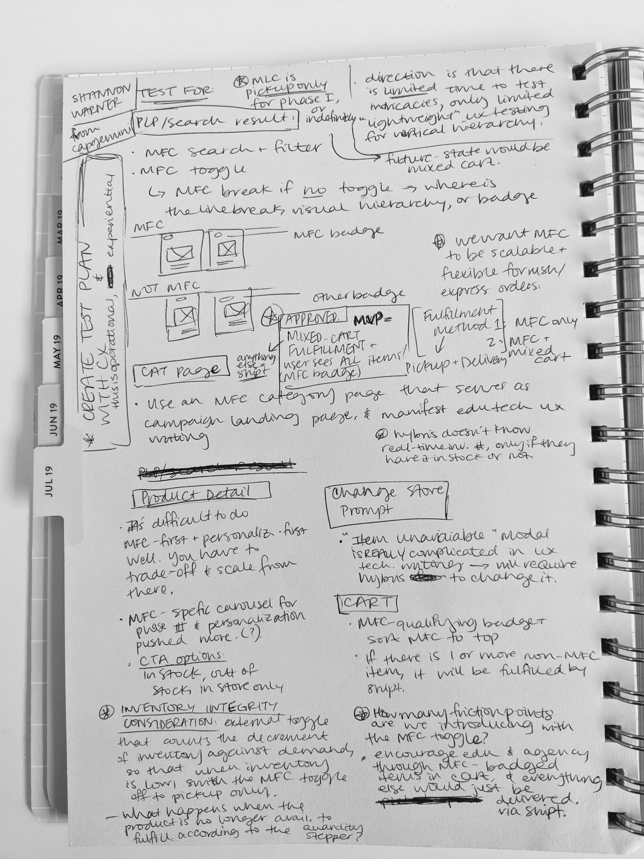
Thinking out-loud through all use cases.
Sketching with teammate Brittaney Headings.
Teaching UX
Through bi-weekly lunch and learns, individual members of the digital teams held Lunch and Learns to teach their expertise.
“Technical Writing for Inclusivity: Language, Tone, and Reading Levels”
“Usability Testing: Shining a Light on How Research Guides Our Product Development”
Training Teams in User Insights Over Assumptions
In partnership with Ekko Studio, research of Consumer Insights, and the Retail UX team, we supported empathetic research activities and obtain key insights to shape experiences, mapped out the full guest experience to define opportunities, translated business needs into a content strategy that works across platforms, built out experiences that could be used to gain feedback from test participants prior to launch, and conduct qualitative research activities to inform our approaches.
Researching for Meijer required a strong understanding of the strengths and shortcomings of different research methods, including when and how to apply them during the product development process.
My role in the team was to consistently encourage the team that research can tell us what is happening, but we need insight to understand why it is happening, and crucially, what to do about it. Researching for Meijer was instrumental in team attunement to local resources and culture, and gave coherence to the entire experience. Through a tactile understanding of research methodologies and encouraging proactive team dialogue, my research interpretation cultivated a lively and diverse culture that elevated our design process.
So many thanks
The Meijer app is built and continually improved in wonderful collaboration with the incredibly hard work and passion of dozens of developers and designers of every concentration. My everyday work with Meijer was leading mobile app research and collaborative strategy and design of user experience, and couldn't have been done without the talent of Catie DiCiuccio, Iulia Rontu, Alex Johnson, Brittaney Headings, developers Ian Busch and Ryan Popa, digital accessibility consultants Mack George and Trent Bates, managers Kyle Douglass, Lynette Kruk, and Kyle Durocher. Incredible facilitation of ongoing design strategy lives in partnership with Ekko Studio’s Kevin White and Erik Loehfelm, and designers Rachel McDowell, Kaila Piepkow, and David Meldrum.


